

Wednesday, February 27, 2013
Photo Inspiration: Coolest Snow "Man" EVER
Ok so I kind of cheated and took a picture of a picture. But I was definitely INSPIRED after this to go and try to build a snow sculpture. Check out what my cousin made. This is talent.
You Can't Miss This: Print Isn't Dead & Funny and Creative Ads
A. This week on my blog Chris Spooner shows a ton of branding designs to prove that even if many designs are heading online, print won't be dead for quite some time. Too many companies and, individuals for that matter, create logos or ad designs that are only available for print or for 3D products. Too many organizations and people need logos still printed for print to disappear. Here are some of his cool designs for many different brands.


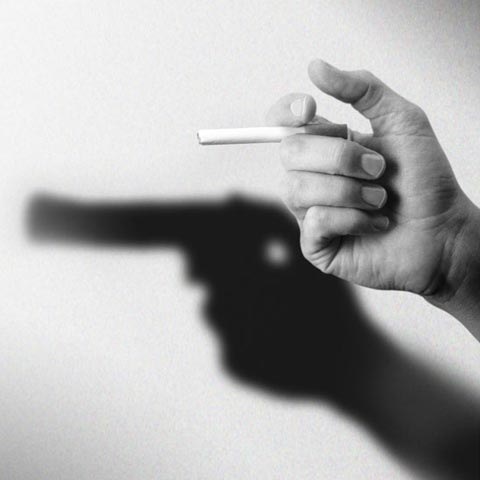
 B. I came across some awesome ad designs on creativenerds.co.uk. I think humor needs to be incorporated often in ads. Some of these designs were so detailed. I was impressed! But They for sure were funny and extremely creative. Take a look! Click here for all of them on the website. P.S. Creepy McDonald's Ad...


Tuesday, February 26, 2013
Response: Presenting to Publishers
Presenting our final Meredith prototypes was exciting, yet a little nerve-wracking. I was much more confident with my redesign than my orignal Stir prototype, but you never know what the people you are presenting to will think about it. I was really impressed with the others I saw as well. This initial presentation has helped me realize just how many ideas and elements you must think about before just beginning a new publication. Color palettes, typefaces, headline style, body type style- the choices are never-ending! I am excited to begin working as a team. I think everyone contributing their original ideas while following a (hopefully) impressive style guide will be exciting. I am expecting some challenges at times but I think that will make our publications more successful in the end. I only stayed for Stir's presentations but I was surprised at how many different angles were taken while designing prototype ideas. It's crazy how someone can be given the same mission statement and title as you but they take it a whole different direction. Even though I have awhile still, I am excited to see how our prototypes end up!
Critique: Final Stir Prototype Design
I knew a lot of changes needed to be made prior to presenting my Stir prototype to the Publishing class. I really appreciated all of the feedback I received in class beforehand. I took those comments into consideration in my redesign. I hope everyone liked the changes. My concept stayed the same, but I made many technical changes and I think my redesign looks a lot more professional than my original. But I'll let you be the judge of that.
This is my first version:


 And these are the changes I made:


 I think my redesign looks more grown up than my original designs. My department spread at first lacked a lot of photography which I think is important to incorporate. My cover in my second design is a little simplified. Many of us agree that less is more when it comes to a magazine. I agree. I think my design in the first cover was a little bit too heavy. I thought the serif/sans serif font mixes helped balance the overall appearance. I hope you guys were more impressed by my second design.
This is my first version:
Wednesday, February 20, 2013
Photo Inspiration: Shadowy Photo of MU

You Can't Miss This: Bold typography posters and icon re-design for OzHarvest
A. This week on my blog, Blog Spoon Graphics, I took a look at Chris Spooner's typography poster designs. I have been really into typography lately but seeing as I am using it for a Vox cover idea, I am looking for all and any inspiration I can find. I like when I can find some really detailed typography designs using fonts rather than illustrations. Sometimes I get so inspired to try sketching some designs, but it turns out looking like a scribble or a left-handed drawing of mine. I have resorted to making the most out of fonts and weights as possible while I design. As I begin to focus more on my details throughout my design, these will be helpful. The spacing and weights are all very appealing and I hope to perfect those skills of mine soon.


B. To all the ICON lovers in class: this one's for you. I came across DEXIGNER.com and saw a really cool brand design using so many icons throughout their ads and marketing designs. The designs I saw were all apart of the redesign project for OzHarvest, a food rescue charity. OzHarvest's logo changes to an illustration using all icons, which I have seen in a few of my classmates designs. The icons reappear in many other branding designs for OzHarvest. Here is the gist of the redesign:
"Long time collaborators Vince Frost and Droga5's David "Nobby" Nobay, set their teams together to create a new identity which would visualise the charity's new brand strategy, developed following a series of brand workshops conducted by Droga5. Synthesised as "nourishing our country," the rebrand aims to support the growth of the organisation, helping OzHarvest to create new opportunities to communicate and expand their vital services."
Here are a few examples of their designs:


Response: Meredith Prototypes Tuesday Takeaways
Yesterday in Advanced Design lecture, we began critiquing our Meredith magazine prototypes. For many of us it was the first time we have started completely from scratch and thought up an entirely new magazine. I am in the group for Stir, a magazine geared towards entertaining and hosting. Immediately, I wanted am image on the cover that was going to appeal to someone close to my age, and appealing to someone who is an entertainer. The most difficult part of it all, for me, was keeping a general theme throughout. In the past I have worked on many different types of projects, so I have experienced drastic idea changes in between. For the prototypes we will pitch for Meredith, I need to remember to tie in a general theme throughout my cover, feature and department spreads. I wanted Stir to be a bold and upbeat publication. Our audience is young and ready to entertain. This magazine should do nothing but inspire them to improve their changing lifestyles. Here's what I had for Tuesday, but many changes will be made by Monday. A lot of my feedback was about details throughout like spacing, type faces, etc. The suggestions from Erica, Jan, Andrea and classmates will teach me to be more detailed oriented in my future designs.


I am glad I got feedback from the class and will be ready to put those ideas into my next design.


I am glad I got feedback from the class and will be ready to put those ideas into my next design.
Critique: T/F Covers
As you all know, i'm in the cover group for the True/False issue. After a few revisions I think I've narrowed down my concept to create something really eye catching for Thursday's critique. I started with a variety of designs, but none seemed to really capture that "10th anniversary" message. With my second round designs I tried to amp up my "X" idea. Jan suggested maybe using the number 10 instead, which I am applying to one of my designs for tomorrow. Here's what I've had so far. I look forward to your comments tomorrow. Also feel free to comment about any suggestions for my final designs! I am wanting to try some detailed typography.


 Now that I've gone different routes with my designs and heard a lot of valuable feedback, I am ready to create an eye catching and content driven design for Thursday.


Tuesday, February 12, 2013
Photo Inspiration: Long Island

You Can't Miss This: Vintage Graphic Design and Older Vox Cover
A. This week on my blog, Blog Spoon Graphics, I came across thirty different vintage graphic designs used for advertisements, logos, product packaging, etc. I never realized how many modern companies use older styles for their design. There were many similarities among the fonts used and color palettes. Most of the colors used, if not grayscale, were neutral color palettes or dark colors. I did see a few with a brighter red but other than that the colors were dark. My favorite of the thirty options was probably for Sperry Topsider. Once again the typography caught my eye and I thought this appeared very clean and attractive. For the entire list go to http://blog.spoongraphics.co.uk/articles/30-modern-examples-of-vintage-style-graphic-design

Here are some of the others:


B. I was googling original magazine features and one of the first images I came across was actually a Vox cover. I was really intrigued by the design and when I clicked to make it bigger I realized it was Vox! This is the one I found:
 I should know who designed this, because I actually wrote the boutique article two summers ago, but I don't recall ever seeing the cover of this issue. I thought this was super creative. I also noticed how the teasers appeared a little differently also. I think it works for this design. I thought this cover was really creative and I think it's important as a designer to think outside of the box. The feature story was awesome too. With statistics, unless you're a complete sports fanatic, they can get pretty boring and/or confusing. I thought this feature design did an awesome job of breaking up the numbers and creating a nice image for the reader.


Here are some of the others:


B. I was googling original magazine features and one of the first images I came across was actually a Vox cover. I was really intrigued by the design and when I clicked to make it bigger I realized it was Vox! This is the one I found:


Response: Meredith Project and 10/5
I am in the "Stir/Steep/Host/Grown" (title subject to change) group for the Meredith publication project, and after receiving the mission statement and possible story ideas, I am so excited to get started. One article that seems very entertaining was about youngsters like us trying to mature and upgrade our liquor selection. I think this can be really successful and it really offers a variety of design ideas. I think the article is timely and relevant for our target audience. I am still trying to re-vamp the title, but "Stir" and "Host" are my favorites so far. The only magazines I subscribe to are usually fashion or fitness/beauty publications, so looking through different food and entertaining magazines was interesting and very eye-opening. I am really pleased that our target audience for Stir is young adults. Not only can I relate on a personal level, but I can also think what would my friends or myself think about this magazine design.
Also, I wanted to respond to our next five 10/5 ads we saw in class. I've already critiqued my own in a different post, but I wanted to say how great everyones turned out. There was a lot of diversity in all of the ads. Can't wait to see the finish products. This was what the class picked as their favorite of mine:

Also, I wanted to respond to our next five 10/5 ads we saw in class. I've already critiqued my own in a different post, but I wanted to say how great everyones turned out. There was a lot of diversity in all of the ads. Can't wait to see the finish products. This was what the class picked as their favorite of mine:

Critique: 10/5 Assignment
This week I'll be critiquing my first ten Vox Talk Ads from our 10/5 assignment. Unlike the majority of the class, I started mine on InDesign rather than sketching. This was due to the fact that my drawing skills are extremely limited. I am pleased with how my next 5 turned out, but am looking forward to your reactions in class today. There were a couple of ads that I kept the same, but others I tweaked quite a bit. The biggest challenge was the amount of text I needed to use in the ads. I struggled with how to fit it in an appealing manner. One of my choices used an illustration so I thought that was a nice change to my other typography designs,


Please note that the last one (right above here), if chosen, will be fixed with a better illustration. I have more realistic hands to trace and looking now I think I'd add more color. I'm looking forward to seeing everyones ads today!
Tuesday, February 5, 2013
You Can't Miss This: Typography Magazine Covers & Abstract Geometric Poster Design
A. I discovered a website with an article and images about typography magazine cover designs. This caught my eye because I personally love working with typography. I still feel like there is a lot for me to learn about font and typefaces, however, so I enjoy coming across sites like these. Coverjunkie showed numerous different covers over time that really played up typography and used words as visuals instead of photographs or illustrations. However, the ones I liked the most seemed to combine both. Here are examples of some that I like.
(All covers can be seen on http://www.coverjunkie.com/blog/typographic-covers)
All of these ideas are creative. The typography is played up, but still not too busy or un-readable. All do a great job of keeping the image dominant.
B. On my blog, Blog Spoon Graphics, I read an article on creating abstract geometric patterns. I thought this was interesting, and relevant, because earlier in lecture today many of the designs we saw had a retro-ish vibe going on. The pattern that designer Chris Spooner creates looked a little bit retro to me. It also was textured, which we also brought up today in class. I liked this tutorial because it worked first with Illustrator, followed by Photoshop. I think with the spring preview assignment I realized how important it is to stay familiar, and proficient, with illustrator, so anything new I can learn on there is beneficial. I won't bore you with a step by step, but check out the finished look. I've found that the blog I'm following will really come in handy when I'm trying to spice up any design. There is always something new to learn for the programs we use.


Lil Wayne by Ryan Barber JOCO by Jimmy Gleeson
(All covers can be seen on http://www.coverjunkie.com/blog/typographic-covers)


All of these ideas are creative. The typography is played up, but still not too busy or un-readable. All do a great job of keeping the image dominant.
B. On my blog, Blog Spoon Graphics, I read an article on creating abstract geometric patterns. I thought this was interesting, and relevant, because earlier in lecture today many of the designs we saw had a retro-ish vibe going on. The pattern that designer Chris Spooner creates looked a little bit retro to me. It also was textured, which we also brought up today in class. I liked this tutorial because it worked first with Illustrator, followed by Photoshop. I think with the spring preview assignment I realized how important it is to stay familiar, and proficient, with illustrator, so anything new I can learn on there is beneficial. I won't bore you with a step by step, but check out the finished look. I've found that the blog I'm following will really come in handy when I'm trying to spice up any design. There is always something new to learn for the programs we use.

Also something to check out on Blog Spoon Graphics is an "Inspiration Fix." Designer Chris Spooner posted some AWESOME designs that are his personal favorites. Here were some great ones. There are more to check out on the site. The Inspiration Fix link is above.


Lil Wayne by Ryan Barber JOCO by Jimmy Gleeson
Subscribe to:
Comments (Atom)