

Tuesday, May 7, 2013
Photo Inspiration: Grad Pics
My sorority sisters decided to take graduation pictures with each other before the madness next weekend . I loved the angle the photographer took with this one. But now I'm reminded I am graduating in a week and a half so I'm going to go cry now.

You Can't Miss This: Art & Design Inspiration Fix and Conceptual Cover Designs
A. This week on the blog I follow, blog.spoongraphics, Spooner gives one more gallery of "design inspiration." He takes a variety of different illustrations, typography designs and conceptual designs to show what types of different design techniques can create a great design. My personal favorite was this one because my next step in life will be in New York City. I loved this design because of the brightness and after taking a closer look, it was an illustration that uses only a variety of geometrical shapes to create it. I think the use of transparency in some of the buildings was a nice touch too. It almost gives the idea of light shining on the skyscrapers.


B. I have struggled a little bit trying to come up with a conceptual idea for the Drunkorexia cover, so I thought for one my last posts I would display some photos of examples of magazine covers that used very conceptual ideas. Some were much more far fetched than others, but they all portrayed the message of the coordinating feature. Here were some of the examples of very conceptual designs.


B. I have struggled a little bit trying to come up with a conceptual idea for the Drunkorexia cover, so I thought for one my last posts I would display some photos of examples of magazine covers that used very conceptual ideas. Some were much more far fetched than others, but they all portrayed the message of the coordinating feature. Here were some of the examples of very conceptual designs.


Response: My last blog post for class
I never ever thought I would see this day. This is the last time I will blog for my advanced design course. The weekly posts were very appealing to me at the beginning of the semester, but I realized how much it helped me look at dozens of different design techniques, tutorials, trends, and styles. I have come across some websites that I now frequently follow, whether it be for Illustrator or Photoshop tutorials or just new design trends. It was also nice for us to be able to share our posts as well...I got feedback on some of my critiques and I also got to experience new websites that my classmates found. Even though it FLEW by, I realized today, after finishing my portfolio, just how far I have come. I began the "journey" for magazine design my junior year, and am so happy about the choice I made. Yes there were times I wanted to scream at all of the assignments due in the same week, but I now have a complete portfolio thanks to this class. I also have seen improvements. I came in the class without paying very close attention to small details. I now realize small details can play a huge role in any design...whether it be a spacing issue, photo choice, etc.
I am very thankful for this capstone because not only did I get hands on experience and design clips, but I also was exposed to a lot more work than any other course could offer. I am ready to pursue this field and see what my internship can teach me more about the art of magazine design.
I am very thankful for this capstone because not only did I get hands on experience and design clips, but I also was exposed to a lot more work than any other course could offer. I am ready to pursue this field and see what my internship can teach me more about the art of magazine design.
Critique: Drunkorexia
This week we brought back more first drafts for the Drunkorexia covers. I thought it was a photography cover only, which explains my design concepts. On Thursday we will bring back more. I am going to present one photo option, one illustration design, and one conceptual design that could possibly be a studio shoot idea. I had a little bit of a difficult time working with the photos only because all of the models were bodies only.
It took awhile to determine where and how to place the type, but I think the font choice worked out ok. I tried making the typefaces bold to portray the seriousness of the topic. My illustrated option will probably be most time consuming. Here are a couple from the first round. Followed but the three I presented in class today.


It took awhile to determine where and how to place the type, but I think the font choice worked out ok. I tried making the typefaces bold to portray the seriousness of the topic. My illustrated option will probably be most time consuming. Here are a couple from the first round. Followed but the three I presented in class today.


Wednesday, May 1, 2013

You Can't Miss This: Pixel Characters in Illustrator and SELF Magazine Redesign
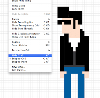
1. This week on the blog I follow, Chris Spooner posted yet another tutorial. This week the tutorial Spooner posted is how to create 8-bit pixelated characters using Illustrator. I thought this was cool because he creates these cartoon, almost video-game-ish characters using simple shapes. This tutorial is great if you ever want to create an animated illustration. Here are some examples.


2. I have a subscription to SELF magazine, and they recently have undergone a HUGE redesign. I love it. I think the new masthead and layout is a much more modern look. It is more lively and bright, and I think that's important when designing a magazine focusing on a healthy lifestyle. The fonts are much bolder and I realized more color brightness used throughout too. The older style was much more traditional. It was also nice because it was clean and visually appealing, but I think the redesign was more "fun." Here are some before and after photos of the magazine.


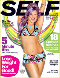


2. I have a subscription to SELF magazine, and they recently have undergone a HUGE redesign. I love it. I think the new masthead and layout is a much more modern look. It is more lively and bright, and I think that's important when designing a magazine focusing on a healthy lifestyle. The fonts are much bolder and I realized more color brightness used throughout too. The older style was much more traditional. It was also nice because it was clean and visually appealing, but I think the redesign was more "fun." Here are some before and after photos of the magazine.


Response: Online Portfolios
The online portfolios are finally complete! I was very happy with my finished product. I really tried to get my website to mimic my mini portfolio. That way people can remember my style when they see either portfolio. My picture will be changed once I receive my head shots back that I took on Monday. I revised a lot since the first time we critiqued the sites in class. I changed my color scheme and also added a description under each piece of work I posted. I am glad they are complete because this is much easier to send to employers rather than pdf clips. Now to finish up my mini portfolio! I can't wait to see how they all turn out. Here are some screen shots of my website.


Critique: Having Faith
Last week we all turned in three different concepts for the Having Faith feature coming up. For tomorrow, we will only present one final design. I will be re-designing one of the following concepts:


Feel free to give feedback on which you think is stronger. I will be changing the typography on either I choose. For the top design, I liked the concept but my color was a lot different when I printed it for class. I will have to darken a lot of the design for it to show up properly when printed. The challenge with the photography cover concept was choosing a picture. Now that I know that some of the stories won't be featured in the print issues, that really narrows down my options for a cover photo. I think for tomorrow I will revise both and see which portrays the stories best.


Wednesday, April 24, 2013
Photo Inspiration: earrings

Tuesday, April 23, 2013
You Can't Miss This: Instragram FX by Photoshop and illustrated magazine covers
A. This week, the blog I follow is celebrating six years of being on the web. On the blog there were mostly just highlighted archives from years past, so I found one that caught my eye. Chris Spooner posted a tutorial on how to do our favorite Instagram photo effects on Photoshop. I'm sure after playing around in the filter gallery we could eventually figure out a similar effect, but this is a quick guide on how to get them quickly. Here are some of the examples of photos that have been adjusted in photoshop but look like they've been on Instagram.


B. Going through our online portfolios today made me realize how many of us designers enjoy doing illustration work. I thought these magazine covers would be fun to talk about because they strictly feature illustrations and created images instead of photography or typography (like I've blogged about before). These were pretty great. Some were a lot more abstract than others, but I thought it showed the diversity that's allowed when publications decide to use illustrations or icons.
Critique: Online Portfolios
I thought it'd be easier to write a critique rather than a response of my online portfolio, mainly because I know many changes need to be made. I had a rough outline finished for today's class. I think I am going to make adjustments on my type size and color palette. Right now, I just have a templated color palette, but I am going to try and mimic my mini portfolio with a mint green and white typeface. I am ready to see the finished product! That being said, I am going to need to work hard this weekend on my site. I had trouble at first deciding what page to put my design clips on.
After looking at a few other design portfolios, I think it might be necessary to include some thumbnails on my initial page. That way employers or colleagues can have easy access to my designs without having to navigate through my site too much. I also will be adding a pdf clip of my resume, so I can get into detail about past work experiences. Abby is going to take my picture so I can finally replace my spring break '12 photo that is currently all I have. Here are a couple of screen shots of what I have right now. Like I said, the flower photo will be replaced with yours truly. Be ready to see my final website next Tuesday! I will hopefully have my domain back by then. For now you can find my site at
www.odf7c5.wix.com/oliviaframedesign
Response: Mini Portfolio Take 2
Today we went around class and shared what each of us have so far for our mini portfolios. I am happy with my feedback. I feel like all of the comments will help make my portfolio more successful. I also decided that I am going to keep the same color scheme for my website as well. I think it will help brand me a little better and make my work recognizable in the long run. I already critiqued my mini portfolio (either last week or the week before). But after some changes, here is what I had in class today:


I'll leave it at that. You get the point. But like I said, everyone's feedback has inspired me to make some changes. I might have a few cover additions in the next couple of weeks too. I can't believe graduation is almost here. Scary!!!
I'll leave it at that. You get the point. But like I said, everyone's feedback has inspired me to make some changes. I might have a few cover additions in the next couple of weeks too. I can't believe graduation is almost here. Scary!!!
Wednesday, April 17, 2013
Photo Inspiration: Storm pic

This is some hail my friend had hit her house a couple of hours ago. Scary! Glad that stayed away from my car.
Subscribe to:
Comments (Atom)