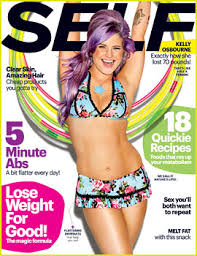
2. I have a subscription to SELF magazine, and they recently have undergone a HUGE redesign. I love it. I think the new masthead and layout is a much more modern look. It is more lively and bright, and I think that's important when designing a magazine focusing on a healthy lifestyle. The fonts are much bolder and I realized more color brightness used throughout too. The older style was much more traditional. It was also nice because it was clean and visually appealing, but I think the redesign was more "fun." Here are some before and after photos of the magazine.
Wednesday, May 1, 2013
You Can't Miss This: Pixel Characters in Illustrator and SELF Magazine Redesign
1. This week on the blog I follow, Chris Spooner posted yet another tutorial. This week the tutorial Spooner posted is how to create 8-bit pixelated characters using Illustrator. I thought this was cool because he creates these cartoon, almost video-game-ish characters using simple shapes. This tutorial is great if you ever want to create an animated illustration. Here are some examples.
2. I have a subscription to SELF magazine, and they recently have undergone a HUGE redesign. I love it. I think the new masthead and layout is a much more modern look. It is more lively and bright, and I think that's important when designing a magazine focusing on a healthy lifestyle. The fonts are much bolder and I realized more color brightness used throughout too. The older style was much more traditional. It was also nice because it was clean and visually appealing, but I think the redesign was more "fun." Here are some before and after photos of the magazine.
2. I have a subscription to SELF magazine, and they recently have undergone a HUGE redesign. I love it. I think the new masthead and layout is a much more modern look. It is more lively and bright, and I think that's important when designing a magazine focusing on a healthy lifestyle. The fonts are much bolder and I realized more color brightness used throughout too. The older style was much more traditional. It was also nice because it was clean and visually appealing, but I think the redesign was more "fun." Here are some before and after photos of the magazine.
Subscribe to:
Post Comments (Atom)


No comments:
Post a Comment