

Tuesday, March 19, 2013
Photo inspiration: Dinner
You Can't Miss This: Hand-written typography and student design awards
A. This week on the blog I follow, blogspoon graphics, Chris Spooner gives some great examples of hand lettering design. It sort of reminded me of one of my first blog posts I had about the college girl with all of the humorous hand written typeface designs. Spooner posted a variety of different designs. Some had words and letters that formed a picture, others were just nicely written words against a photograph background, and some were hand written words that added textures or other design elements to make them stand out.
Sometimes I think my bad handwriting could never produce something like these designs, but maybe with the right design elements and tweaking on illustrator or photoshop I can create something catchy. It's crazy how much these written words change when they are transformed with design programs. Here are some examples. For a list of all of the examples Spooner gave, click the link in my first sentence.


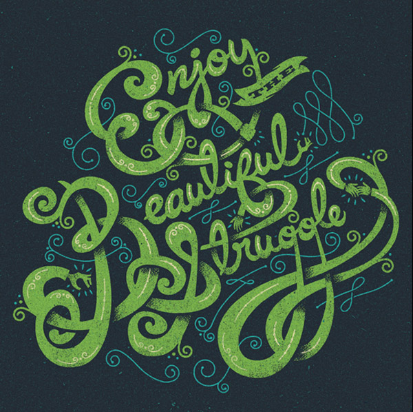
 B. I also came across a website showing creativity awards for magazine, advertisements, branding, etc. I thought this was interesting because looking through the student winners can be really inspiring. They had dozens of categories for contests. Some included magazine cover design, typography designs, food and beverage packaging design, billboard design, and more. Here were a few that really caught my eye. For a complete list of the categories and the 2012 winners you can click here.
Sometimes I think my bad handwriting could never produce something like these designs, but maybe with the right design elements and tweaking on illustrator or photoshop I can create something catchy. It's crazy how much these written words change when they are transformed with design programs. Here are some examples. For a list of all of the examples Spooner gave, click the link in my first sentence.


Response: September Issue
Today in class we got to watch The September Issue. It was cool to get to see the magazine industry up close and personal. I think it was definitely eye opening, like Erica said, to see just how much really goes on in that kind of consumer magazine setting. It was definitely intense. The amount of photos that the Vogue staff works with is unbelievable. (But awesome, of course).
I can't imagine the stress of putting together an issue that size. It would be quite an experience. This was my favorite photo from the movie. I think my biggest takeaway from the movie was that I better get a little tougher if I decide to eventually work in the consumer magazine industry..

I can't imagine the stress of putting together an issue that size. It would be quite an experience. This was my favorite photo from the movie. I think my biggest takeaway from the movie was that I better get a little tougher if I decide to eventually work in the consumer magazine industry..

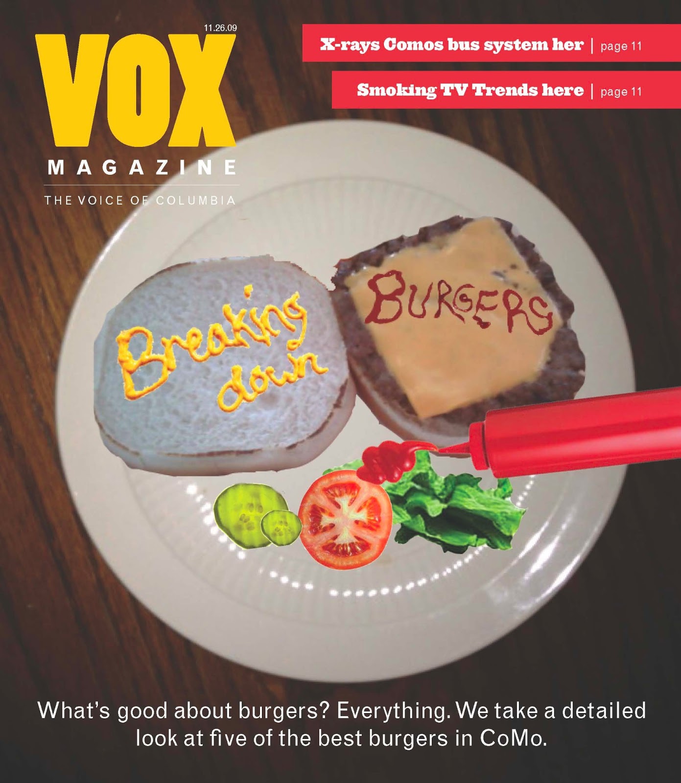
Critique: Burgers part 2
So last week was the 2nd round of the burger story drafts. I had a difficult time with this one because it was so conceptual. As suggested, I stuck with the idea of creating type using real mustard and ketchup. I thought this would give the cover a fun look. I would've liked to see my design carried out by the studio photographer because these stock photos were not the highest quality. The finished product I had in mine was a broken down burger with its components out for the photo. The ketchup and mustard hed would dominate the burger just a little, without taking away from the rest of the photo. Here is the (very conceptual) idea I ended up with.


Tuesday, March 12, 2013
Photo Illustration: Magazine design is everywhere
I was at my part-time job at the mall when something caught my eye. At a glance it looked like a magazine, but it indeed was makeup. There is a makeup kit at Victoria's Secret that mimics the layout of a magazine. I snapped a picture of it because I thought it was pretty cool. Magazine design is everywhere!


You Can't Miss This: Landscape illustration and Department page inspiration
A. This week on my blog, Chris Spooner posted a tutorial about something pretty relevant to our class. I've seen a lot of awesome landscape illustrations on various cover designs and that is what he talks about. Also, he incorporates the use of texture which we just got through looking at in lab last week. The landscape illustration tutorial is nice because it uses a variety of really basic shapes and a simple color palette. Sometimes less is more, right?
The texture really ads to the layout of shapes. I sometimes underestimate the power of texture. It really does add depth to your design. For those designers into illustration design, I would take a look. This illustration style is a lot like some i've seen in many popular illustrations.
Here is an example of the landscape illustration before and after the texture effect.


B. I was browsing through some design portfolios and came across a really nice one. It was Michael Moran's portfolio. I was specifically intrigued by his use of department page designs. I am designing the department pages for Debut so any inspiration or concept ideas are really helpful. He broke his site up into types of pages he designed. His department pages were clean and navigable. I think department pages need to be enticing yet consistent with their design since they are used repeatedly throughout issues. Here are some good examples of how Moran used large and bright illustrations to compliment his body text.

 I also think consistent elements are successful in department page design. The color coding blocks at the top are not only eye catching but also helpful for finding pages.
The texture really ads to the layout of shapes. I sometimes underestimate the power of texture. It really does add depth to your design. For those designers into illustration design, I would take a look. This illustration style is a lot like some i've seen in many popular illustrations.
Here is an example of the landscape illustration before and after the texture effect.


Response: Mini Portfolios & branding myself
Today a Mizzou media employee spoke to our class about our mini portfolios we will make before the semester ends. I am really glad this is apart of our classwork because I think it will really help with my job hunting experience. Some of the designs I saw from my classmates really inspired me for future designs and revisions. For example, many of you had awesome detailed illustrations. I think those will really set designers apart form one another. Not only do illustrations show your attention to detail and skills on illustrator, but it also can portray your personality or "brand" in a way.
That is what I really want to focus on when I create my mini and online portfolio. I want people to remember me and remember my designs. Going through and revising my designs will be a task, but incredibly worth it. I really will need to focus on detail, perfecting styles and tweaking little things to perfect my designs.
I really liked the idea of a detailed resume option, as well as informative blurbs about the designs I've included in my portfolio. I am excited to get started on both projects.
Critique: 3.28 Design
Last week was round one of the Burger covers for the 3/28 issue. I had a lot of fun with this one. Once I read the hed option "Breaking down burgers" I came up with the idea to literally break down a burger and illustrate what you see. Here I came up with the idea to create typography with actual condiments (ketchup and mustard). It started off a little bit plain so I am going to add more detail and content to my revised designs for Thursday. Here was step one of the typography. I wrote the hed on a paper towel so the background could easily be deleted. I think I may go about this a different way for Thursday.


Here are some other designs I started with. One was a photo concept (this was from google, I would have the photographer shoot a photo including the restaurant's burgers). The last design is a typography technique with an illustration.


I will also have a catchier hed and dek for Thursday too. I think my concept has great potential but I will need to capture some detail for the final design. If you have any suggestions let me know!

Here are some other designs I started with. One was a photo concept (this was from google, I would have the photographer shoot a photo including the restaurant's burgers). The last design is a typography technique with an illustration.


Wednesday, March 6, 2013
Photo Inspiration

Critique: Portfolio Starters
I am really excited to put my portfolio together in the next couple of weeks. I got a lot of great feedback when we brought in our clips the other day in class. I appreciate your suggestions! Here are some of the things I brought in. A lot of my designs will undergo some revisions. There were a few where I just needed to tighten up some of the technical aspects of my design (i.e. font size, paragraph style, headings, etc.) I will also be adding a few clips next week because I am currently working on the burger cover designs and the After Dark iPad design. Here's what I had in class the other day.


You Can't Miss This: Showcase sports logos and food magazines
A. From my blog, I found a cool archived article on a showcase of sports logos by designers. Chris Spooner talks about changes you can make to create more elaborate logos with perhaps more of a content driven design. He explains:
"Unlike your typical logo, the badges and emblems used by sports teams often include detailed illustrated elements, usually include a mascot or character and make use of perspective to create three dimensional effects."
Here are some examples of the sport logos he was talking about.


B. For the second thing you "can't miss," I wanted to take a look at some food and drink magazines to get some inspiration for my meredith group's publication "Debut." I am super ready to get started but the following covers were great inspiration for some elements we could include. These were on the Huffington Post's website for "16-under the radar food magazines." There was quite a diverse collection of cover designs. They range from raw meat on the cover to deluxe meals to just simple typography. Here were some examples:


Response: T/F Documentary-"25 feet from stardom"
This past Sunday I saw 25 Feet from Stardom, a documentary on background singers. It was awesome! I didn't really know what to expect going into it. The film talked about what it was like to be a background singer, the ones who made the songs complete but never stole the spotlight. It started with introducing the famous group starting in the 60's, "The Blossoms." That backing group sang for famous artists such as Frank Sinatra, Elton John, and were the familiar voices in songs like "The Monster Mash." Darlene Love and Lisa Fischer were two female singers that successfully took their background singing profession to a new level. Fischer and Love established solo careers and finally got their spot in the front. They were both very successful and holders of grammy nominations and awards.
The film was informative but more importantly, inspiring. The coolest part about it all was that Lisa Fischer actually came to the True/False Festival and introduced herself to the film's audience. She gave audience members advice and also just shared how she wouldn't stop singing for anything. Even sick with a sore throat she sang a little for the audience. It was a great show.
The film was informative but more importantly, inspiring. The coolest part about it all was that Lisa Fischer actually came to the True/False Festival and introduced herself to the film's audience. She gave audience members advice and also just shared how she wouldn't stop singing for anything. Even sick with a sore throat she sang a little for the audience. It was a great show.
Subscribe to:
Comments (Atom)