

Wednesday, April 3, 2013
Photo Inspiration: SpRiNg BrEaK pHoTo
Shocker, here's a photo from spring break. But I miss the beach already.....


You Can't Miss This:iPhone and iPad App Designs and hilarious magazine mistakes
This week on the blog I follow, blogspoongraphics, there was an article link posted about new iPhone and iPad apps that I thought were really cool. Some of them range from new types of group messaging and I even found one specifically for food pictures. (Incase you're tired of seeing your friend's food on instagram). The app "revel" is designed specifically for food and even has competitions you can participate in.
 One app was called "chow now" and is helpful with online ordering. I was drawn to these apps because they weren't necessarily extremely innovative or revolutionary, but they were designed in an appealing way.
 Here is the link to view the rest of these cool apps.
http://spyrestudios.com/33-modern-iphone-ipad-app-landing-page-websites/
B. Hilarious magazine/newspaper layout mistakes
I came across this Buzzfeed article on a friend's facebook wall and was LOLing by myself at some of these editorial mistakes that DIDN'T get caught before being printed. Enjoy...
http://www.buzzfeed.com/lukelewis/newspaper-and-magazine-layout-disasters
Click the link for all of them but here is a sneak peak of a couple. So embarrassing...


http://spyrestudios.com/33-modern-iphone-ipad-app-landing-page-websites/
B. Hilarious magazine/newspaper layout mistakes
I came across this Buzzfeed article on a friend's facebook wall and was LOLing by myself at some of these editorial mistakes that DIDN'T get caught before being printed. Enjoy...
http://www.buzzfeed.com/lukelewis/newspaper-and-magazine-layout-disasters
Click the link for all of them but here is a sneak peak of a couple. So embarrassing...


Response: Meredith Presentations
Like I said in my critique, we had to show the publishers the first drafts of our Debut design Monday. I think once we straightened out many editorial concerns we are on the right track. I am ready to begin some more designs for our final prototype. The biggest challenge for us so far seems to be keeping things consistent throughout. With a team of many designers that can be difficult at times, but luckily we have a style guide to follow.
Finding photos has also been a struggle considering our stories like "take 5" and our decorating stories need pretty specific artwork. Today we got an email about leaving for Des Moines on the 10th at 4:45am. Woof. That really puts things in perspective and reality is setting in that pretty soon the finished product will be printed and (hopefully) designed just how we want it. Next week I will post some photos of the next couple of stories I am designing. (We just got the copy yesterday.) All of the publishers final copy will be done in the next couple of days so that will allow us to finish up everything.
Finding photos has also been a struggle considering our stories like "take 5" and our decorating stories need pretty specific artwork. Today we got an email about leaving for Des Moines on the 10th at 4:45am. Woof. That really puts things in perspective and reality is setting in that pretty soon the finished product will be printed and (hopefully) designed just how we want it. Next week I will post some photos of the next couple of stories I am designing. (We just got the copy yesterday.) All of the publishers final copy will be done in the next couple of days so that will allow us to finish up everything.
Critique: Pretty Paper and Turning the Tables
Monday we present some design drafts for Debut to the publishers. My first spread included two decorative articles for the Essentials department. My biggest struggle with the design was making it too feminine. Our audience for Debut is meant to stay pretty gender neutral, but with a story titled "Pretty Paper" I instantly began using bright colors and elements which strayed a bit too far from the masculine side. For my revision I am going to include the arrows that are carried out throughout debut. I think it will help make the design more neutral.Cutouts of the photos rather than repetitive squares will also help my design I think as well. Here is what I had for the presentation. I will post all of my new designs and revisions for next week's blog post.


Tuesday, March 19, 2013
Photo inspiration: Dinner

You Can't Miss This: Hand-written typography and student design awards
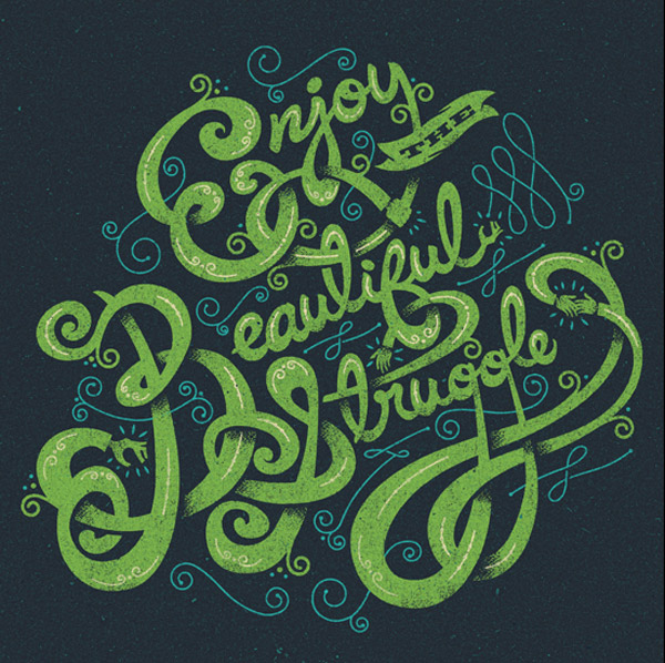
A. This week on the blog I follow, blogspoon graphics, Chris Spooner gives some great examples of hand lettering design. It sort of reminded me of one of my first blog posts I had about the college girl with all of the humorous hand written typeface designs. Spooner posted a variety of different designs. Some had words and letters that formed a picture, others were just nicely written words against a photograph background, and some were hand written words that added textures or other design elements to make them stand out.
Sometimes I think my bad handwriting could never produce something like these designs, but maybe with the right design elements and tweaking on illustrator or photoshop I can create something catchy. It's crazy how much these written words change when they are transformed with design programs. Here are some examples. For a list of all of the examples Spooner gave, click the link in my first sentence.


 B. I also came across a website showing creativity awards for magazine, advertisements, branding, etc. I thought this was interesting because looking through the student winners can be really inspiring. They had dozens of categories for contests. Some included magazine cover design, typography designs, food and beverage packaging design, billboard design, and more. Here were a few that really caught my eye. For a complete list of the categories and the 2012 winners you can click here.
Sometimes I think my bad handwriting could never produce something like these designs, but maybe with the right design elements and tweaking on illustrator or photoshop I can create something catchy. It's crazy how much these written words change when they are transformed with design programs. Here are some examples. For a list of all of the examples Spooner gave, click the link in my first sentence.




Response: September Issue
Today in class we got to watch The September Issue. It was cool to get to see the magazine industry up close and personal. I think it was definitely eye opening, like Erica said, to see just how much really goes on in that kind of consumer magazine setting. It was definitely intense. The amount of photos that the Vogue staff works with is unbelievable. (But awesome, of course).
I can't imagine the stress of putting together an issue that size. It would be quite an experience. This was my favorite photo from the movie. I think my biggest takeaway from the movie was that I better get a little tougher if I decide to eventually work in the consumer magazine industry..

I can't imagine the stress of putting together an issue that size. It would be quite an experience. This was my favorite photo from the movie. I think my biggest takeaway from the movie was that I better get a little tougher if I decide to eventually work in the consumer magazine industry..

Subscribe to:
Posts (Atom)